What is responsive design and why should you care?
When we first started developing websites in 1998, things were pretty straightforward. You knew that anyone visiting your website would be doing so on a desktop or laptop computer, they would likely have a screen that was between 15 and 17 inches in size and they would be using either Netscape Navigator or Internet Explorer as their browser.
Fast forward 15 years and the landscape is very different. These days someone visiting your website could be doing so from a plethora of devices inluding smartphones, phablets, tablets, laptops and desktops with screen sizes ranging from a few inches up to widescreen monitors as big as your TV was 20 years ago. These days surfers could also be viewing your site using many different web browsers including Safari, Chrome, Firefox, Internet Explorer, Opera and many more, each with their own little quirks and foibles ( OK, mostly Internet Explorer and its quirks and foibles )
So how do you ensure that everyone accessing your website has the best experience possible?
There are different ways to approach this. You could choose to create different sites that are designed specifically for smartphones, tablets and desktops and redirect users to the appropriate site, or you could choose to develop a responsive website.
So what is a "Responsive" website?
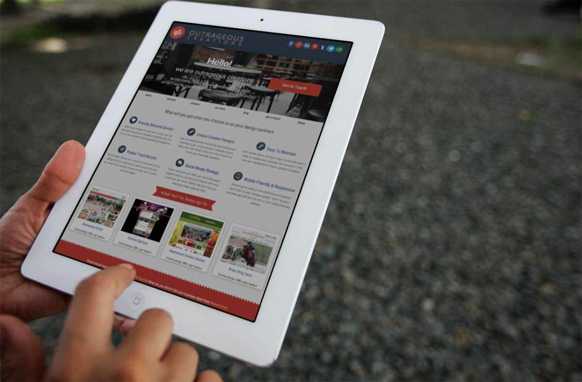
Responsive websites are websites that adapt based on the device or screen size being used to access them. Content is rearranged, different images are served, some uneccessary elements may be removed and navigation may change to suit the device being used. The benefit to site visitors is they get to view the website in the most optimal way for their device. The benefit to you is having only one website to maintain. Our own company website is a good example of responsive design. Depending on whether you are visiting us on a widescreen desktop, a tablet or a smartphone you will be seeing all the same content, but it will be laid out in a slightly different way in order to accommodate the size of screen you are using.
Now, creating a responsive website does take a bit more work than creating a "standard" single size for all website. Careful planning must be used when laying out a responsive website and the site will also have to be carefully tested on many devices and screen sizes to ensure that nothing "breaks", and that everything is easily accessible whether you're using a mouse, trackpad, stylus or touchscreen. And yes, more work does mean more money. But if your target audience is likely to be accessing your site from smartphones and tablets (and a growing number of users are), the extra cost is a worthwhile investment in your business to ensure that your website visitors have the best experience possible.
